Flying Colors
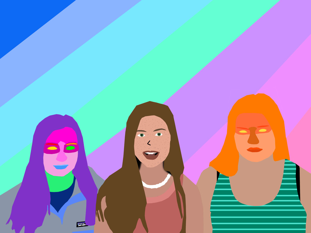
The name of my final project is Flying Colors, because the multicolor background makes the three subjects look like they are flying. The subjects of my work is Lindsey, the figure in the middle. The other two figures on the left, and right side of the screen could be seen as subjects, but Lindsey is portrayed the most accurately, causing the human eye to be drawn towards her. Going into this project, I wanted a challenge. Using this technique on architecture is time consuming, but easy. I realized that if I used this technique on human beings, then it would be significantly harder. The big idea behind my artwork is the visual representation of human beings. My artwork shows that any human can represent themselves as they please, kind of like a "be yourself" kind of message. I wasn't really inspired by anyone, I just liked the previous projects we did with this method, and wanted to do more of it. My artwork expresses a social issue. The issue that other judge people so frequently, that people are starting to be afraid of showing who they really are. I created this piece of artwork by using the polygonal lasso tool, to outline the area of which I want to color, duplicated the selected area (cmd + J), selected the duplicate (cmd + left click on the thumbnail of the layer), and then I colored over that area with the paint tool. I repeated this process until my whole canvas was filled with color. I am very happy with the final result of my project. I think I did a good job at making the figures accurately shaped. I am especially proud of the Patagonia® logo on Erinn's (left) sweatshirt, because it took a lot of time and precision. From this project, I learned how to work diligently with a tough task, under a time limit.
